
Momentum Graphs
Visualizing Narratives

We present the momentum graph, an easy way to visualize how narratives spread and evolve over time on CT. It tracks how discussions emerge, peak, and fade across different communities, helping traders and analysts identify trends before they impact market metrics.
Why graphs for narratives?
In crypto, the metrics that are most often used include token price, market cap, TVL, etc. However, there is a signal that precedes them all – narrative. People hear and discuss projects before an initial opinion or decision to buy/sell is made. Through visualizations, we want to showcase how momentum forms narratives within CT. We want to capture this early signal in the space which is created, and right now this is X for the crypto community.
This is a hard task given that the data that define narratives is not quantitative data (e.g. a time series of a token’s market cap), but rather natural language texts such as posts in X and other social media platforms. Narratives are born and evolve in the interaction among the members of the various communities that comprise CT.
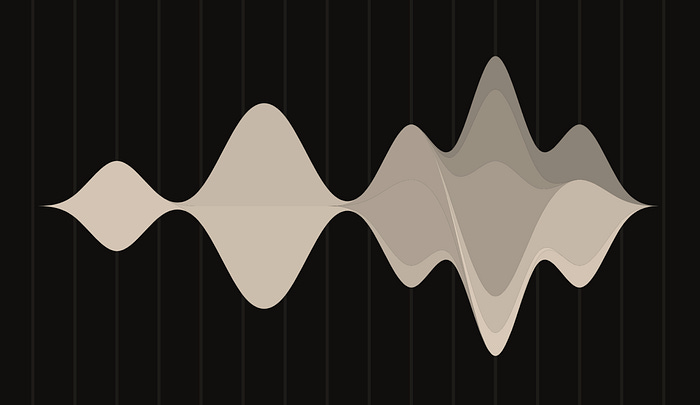
¹Streamgraphs are the perfect visualisation technique for this data — their dynamic, flowing design captures the organic nature of narratives. They show how conversations evolve, with momentum visible in the widening or narrowing streams, with different colors representing the communities involved.
We adopted streamgraph to show how crypto discussions spread on X, and called it the momentum graph since it shows how these conversations grow and shrink over time.
How to read a momentum graph
A narrative in the crypto ecosystem could be defined as a persistent, evolving story about a project or token that captures its essence, resonates with the members of various communities, and recurs regularly through posts in X, shaping perception and inducing action. It has a strong temporal element and it can evolve, expand or contract and diffuse from few communities to many.
We assume that narratives are initially formed in X as a series of individual posts that weave together to create a larger story or theme. Given their short nature which prohibits any dominance in exposition, a community collectively shapes a story through its member’s numerous posts through responses and interactions. This definition of a narrative forms the basis of the main components of the momentum graph which we will now describe.
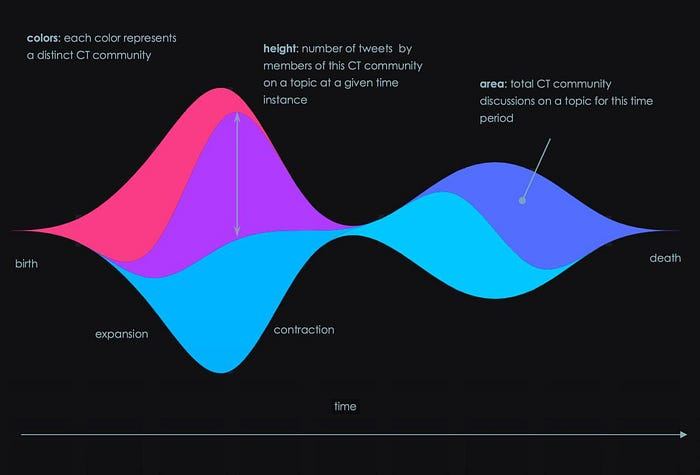
In Figure 1 we can see a sample momentum graph. The horizontal dimension in the graph is time while the vertical represents the relative number of posts. The colors represent distinct crypto communities such as the NFT, Founders or DeFi communities with no particular relation to the chosen color palette. Given a color, the continuous area formed could be interpreted as the total number of posts that has occurred during the associated time period. For any given time instance, the height of such an area would be the number of posts by members of the corresponding community. So a narrative is born usually within a community and it diffuses to other communities where it expands and gains momentum. The degree upon which a narrative is spreading to other communities is proportional to the number of new colors that appear. Irrespective of the degree of diffusion the narrative may be expanding or contracting and eventually may die off and be replaced by other narratives.
Patterns
Let us examine some use cases and how they are manifested in the momentum graph with real data.
Events
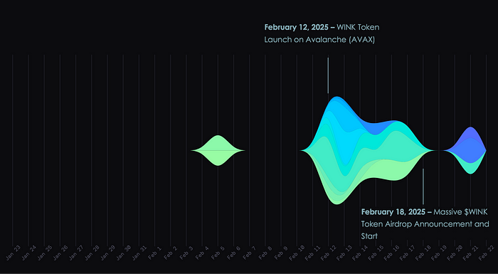
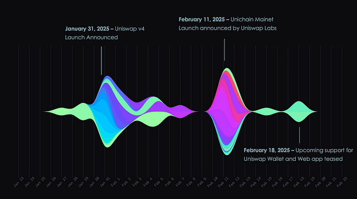
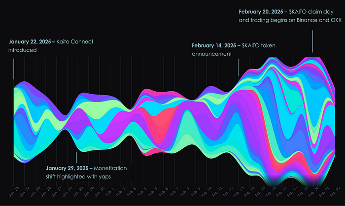
The first natural question that arises when considering momentum graphs is if and how do they relate with actual events such as major announcements regarding projects. A correlation between such announcements and patterns in the graph would constitute a validation regarding the degree upon which momentum graphs depict reality. In Figures 2 to 4 we show three such examples. For example in Figure 2 we can see how announcements such as token launches and airdrops for the WINK project sparked community interest. In Figure 3 we see the Uniswap project, where we can observe that the type of announcement inhibits activity and narrative formation in different communities. It is also interesting to see in Figure 4 the momentum build up and evolution of the Kaito project through time all the way to the airdrop date on February 20.
Narrative diffusion
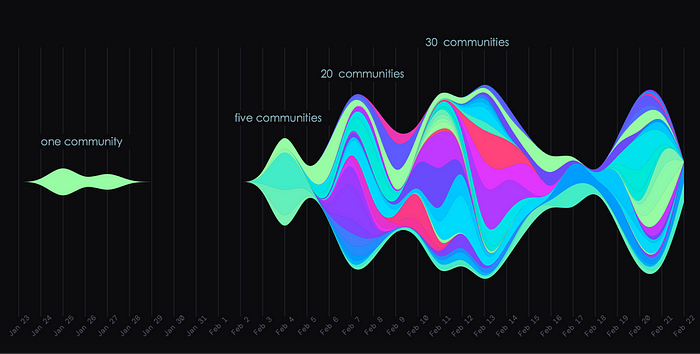
An important aspect of narratives is how they diffuse to different communities. In Figure 5 for instance we can see how the Story Protocol project was initially the subject of discussion of one community while later it was progressively adopted by 5, 20 and 30 communities. Moreover, we can also see that the initial community (light green) prevailed throughout the evolution of the narrative. Such patterns are easily recognizable in the momentum graph and signal an opportunity to examine further a project.
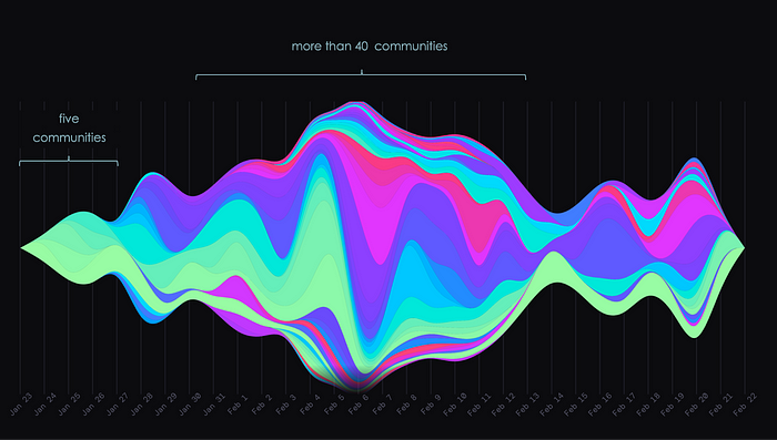
In Figure 6 we can see how the Berachain narrative evolution over the last month centered on building anticipation for its mainnet launch, with a strong emphasis on the Boyco pre-launch liquidity platform. The graph clearly shows the momentum buildup from five communities in late January to more than forty communities on February 6, 2025, when the mainnet launch occurred.
Periodicity
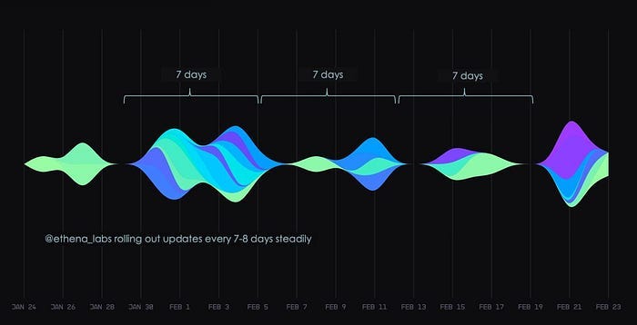
Another interesting, although rare, pattern to observe in a momentum graph is the periodicity that some narratives exhibit. These patterns are typically connected to projects with recurring events, such as scheduled announcements, active communities, or features that naturally drive regular engagement. As shown in Figure 7, the momentum graph for Ethena, known for its synthetic dollar protocol (USDe) and governance token ($ENA), demonstrates consistent weekly momentum due to its ecosystem integrations, market resilience, and community engagement. Another characteristic of such periodic patterns is that the degree of diffusion to other communities is limited, given that these periodic announcements typically concern specific communities.
Future add ons
Our momentum graph will be updated with new features to improve crypto market analysis, making it easier to track trends, engagement, and market dynamics.
Colors
Currently each momentum graph is about one project and the communities are colored. We plan to have different configuration options, such as a graph to represent one community and the projects will be colored or have a group of projects in a graph with the communities colored.Timeline
Key events — like token launches, airdrops, or major news — marked directly on the momentum graph and its timeline. These will add critical context, showing how specific moments drive shifts in narratives or spikes in community activity.Extended History
Extended history feature that will let you define a time frame, suitable for long-term analysis and short-term insights.Hover Data
Hover over any section of the graph, and you’ll uncover additional information such as community descriptions, project specifics, or the exact number of tweets at that point in time. Optionally highlight a specific community narrative flow while the others will appear faded.Overlays
To relate narratives with real-world metrics, we will make it possible to overlay the momentum graph with other graphs, such as market cap, TVL, or sentiment scores, on the same time dimension.Conversational
We plan to have the agent integrated in the graph so one can query it regarding any aspect of the graph in view. So you would be able to ask things like “Why was there a surge in the narrative on February 8th?” or “What are the communities involved in the diffusion that took place on February 15th”.
The objective of these enhancements is to make the momentum graph a dynamic tool for analysis and discovery.
¹Streamgraphs were developed in the mid-2000s by Lee Byron and Martin Wattenberg, who introduced it through their prototype, the “Streamgraph Generator,” designed to handle multiple time series with enhanced readability and aesthetic appeal. The technique became famous in 2008, when Amanda Cox of The New York Times employed it in an article about movie box office revenues.